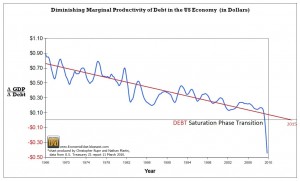
The latest U.S. Treasury Z1 Flow of Funds report was released on March 11, 2010, bringing the data current through the end of 2009. What follows is the most important chart of your lifetime. It relegates almost all modern economists and economic theory to the dustbin of history. Any economic theory, formula, or relationship that does not consider this non-linear relationship of DEBT and phase transition is destined to fail.
It explains the “jobless” recoveries of the past and how each recent economic cycle produces higher money figures, yet lower employment. It explains why we are seeing debt driven events that circle the globe. It explains the psychological uneasiness that underpins this point in history, the elephant in the room that nobody sees or can describe.
This is a very simple chart. It takes the change in GDP and divides it by the change in Debt. What it shows is how much productivity is gained by infusing $1 of debt into our debt backed money system. Back in the early 1960s a dollar of new debt added almost a dollar to the nation’s output of goods and services. As more debt enters the system the productivity gained by new debt diminishes. This produced a path that was following a diminishing line targeting ZERO in the year 2015. This meant that we could expect that each new dollar of debt added in the year 2015 would add NOTHING to our productivity.


